
PANTONE 17-3938 Very Peri. The new Pantone color is described to be courageous, and encouraging personal inventiveness and creativity. Actually, it´s also the first time in the history of the Pantone Color of the Year program that Pantone has created an entirely new color as color of the year.

Pantone Color Institute is the business unit within Pantone that highlights the top seasonal runway colors, selects the Pantone Color of the Year, forecasts global color trends, and advises companies on color for product and brand visual identity.
To arrive at the selection each year, Pantone’s color experts at the Pantone Color Institute™ look all over the world for new color influences. These can include the entertainment industry and films in production, traveling art collections and new artists, fashion, all areas of design, popular travel destinations, as well as new lifestyles, playstyles, and socio-economic conditions or even new technologies, materials, textures, relevant social media platforms and even upcoming sporting events that capture worldwide attention.
For 23 years, Pantone’s Color of the Year has influenced product development and purchasing decisions in multiple industries, including fashion, home furnishings, and industrial design, as well as product packaging and graphic design.
This is Very Peri
We are living in transformative times. PANTONE 17-3938 Very Peri is a symbol of the global zeitgeist of the moment and the transition we are going through. As we emerge from an intense period of isolation, our notions and standards are changing, and our physical and digital lives have merged in new ways. With trends in digital design, gaming, the expanding popularity of the metaverse and rising artistic community in the digital space Very Peri illustrates the fusion of modern life and how color trends in the digital world meets the physical.
“The Pantone Color of the Year reflects what is taking place in our global culture, expressing what people are looking for that color can hope to answer.” says Laurie Pressman, Vice President of the Pantone Color Institute.
“Creating a new color for the first time in the history of our Pantone Color of the Year educational color program reflects the global innovation and transformation taking place.”
Encompassing the qualities of the blues, yet at the same time possessing a violet-red undertone, PANTONE 17-3938 Very Peri displays a spritely, joyous attitude and dynamic presence that encourages courageous creativity and imaginative expression.
Colours that matches:
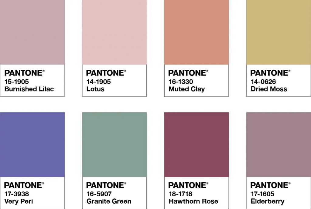
Balancing Act:
is a complementary palette of color whose natural balance of warm and cool tones support and enhance one other.
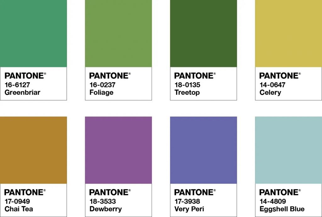
Wellspring:
A holistic and harmonious blend of nature infused shades
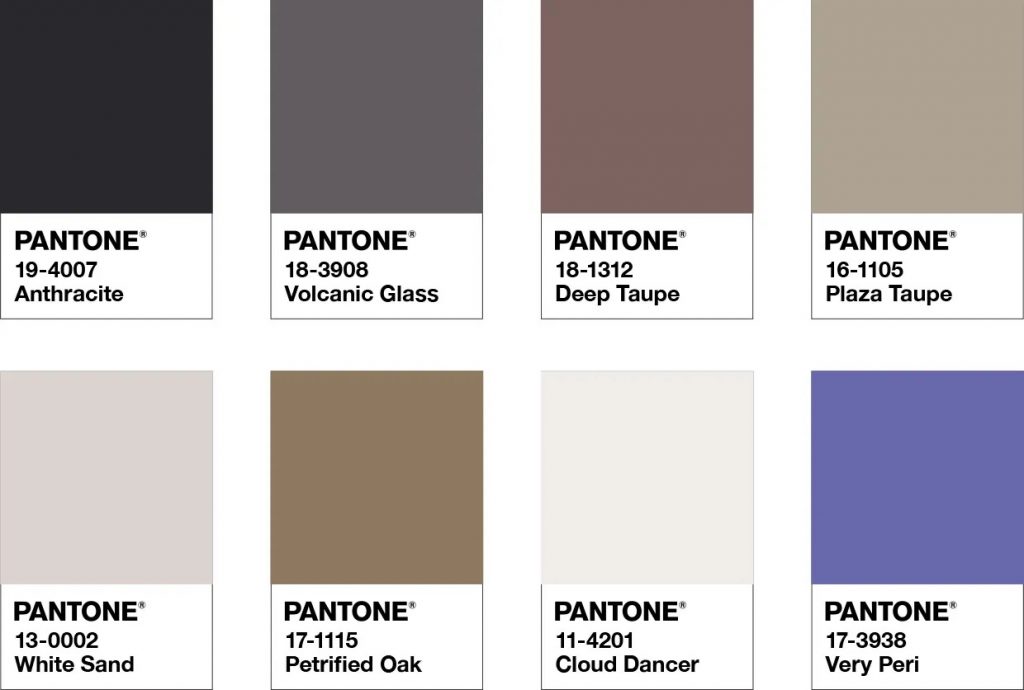
Star of the show
A palette of classics and neutrals whose essence of elegance and understated stylishness convey a message of timeless sophistication.
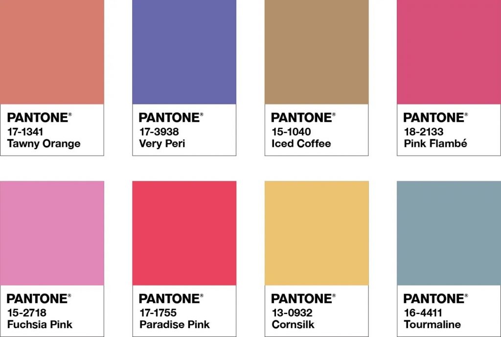
Amusements
A joyous and whimsical color story of irrepressible fun and spontaneity